Producing a pop-up exhibition: Part 1 – establishing themes and designing the panels
Posted 4/2/2019
Dr Amy Jane Barnes writes
In my role for EAMENA and as part of the project’s work funded by the British Council’s Cultural Protection Fund (CPF), I have been tasked with helping to create a portable, pop-up exhibition for seven different countries within the project’s remit, introduced in a previous blog post. My background is in Museum Studies and I have practical experience of developing, writing and curating exhibitions, not least a previous exhibition for an affiliated project, which was about heritage under threat in the Wadi Draa, Morocco. In this post, I will provide an overview of the initial stages of developing the CPF-funded pop-up exhibitions – establishing themes and narratives and designing the panels.
Establishing themes and narratives
The first step was to map out the stories and messages we wanted each panel to present. Here, we built on the experience of the Wadi Draa exhibition. It was decided that these ‘new’ exhibitions would follow a similar thematic pattern, with the addition of a new set of panels introducing the scope, aims, and objectives of the EAMENA project. These panels are common to each of the seven exhibitions, tweaked to give them a country-specific ‘flavour’.
The decision was made that the second group of panels would present an overview of the depth and scope of archaeological heritage within each country. Finally, the third group would consider the cultural and economic value of that heritage and specific threats to it, ending with a ‘call to arms’, aimed at encouraging visitors to promote heritage protection and preservation in their local communities.
With the content for each panel broadly set, it was then up to the individual country teams to come up with specific examples, images, and narratives that reflect the project’s work and key issues and sites in each country. The country teams worked with a set of guidelines drawn up by Julia Nikolaus and myself, which included advice on producing accessible text, image formats, word counts, and potential copyright considerations.
Over the ensuing weeks, the country teams each produced a long list of images and bullet points (sometimes full text) for the content of each panel. From this I was able to start the process of mocking-up the panels and work on editing and refining the text so that it meets the needs of our target audiences and is readable and engaging.
Designing the panels
In the meantime, I got to work on a number of design-related tasks, based on a workflow set out in a very useful ‘Introduction to Graphic Design’ course from Lynda.com:
1. A creative brief for each exhibition, setting out the ‘who, what, why, when and for whom’ of the project.
2. Design research, using the existing branding and graphic identity for EAMENA.
3. Iteration – using Pinterest, I built a mood board of inspirational exhibition design, colour palettes, and ‘resource-light’ ways of encouraging audience participation in the exhibitions, and began to sketch out potential layouts and design ideas.
4. Typography – using font types similar to those used in the Wadi Draa exhibition, i.e. a sans serif font (designed for use with Arabic) for the body text and captions, and a related serif font for the panel titles, to add a bit of typographical interest while maintaining an overall, complementary look to the text.
5. Proposed colour palettes, initially based on the existing EAMENA logo and several project photographs taken in the field, for which I used a really handy online tool.
6. And finally, a series of potential layouts, with interchangeable elements, mocked up using the online design platform Canva, and inspired by the Pinterest mood board (see #3).
At the end of this process, we had a set of five different design mock-ups of varying layouts and featuring different design elements, all drawn up using InDesign. These were then circulated within the project team and to the project directors for their feedback. Once approved, the panel design process could begin in earnest! Part 2 of this post will look at these next steps in greater detail, including selecting images and writing accessible and engaging text.
In the meantime, here are a few tips and resources for anyone looking to put together a similar exhibition project.
• Each of the proposed colour schemes were tested for accessibility, to ensure that there was a sufficient high-low contrast between background and foreground colours. The online WebAim contrast-checker tool proved invaluable in this task.
• As a relative newbie to graphic design, I found the tutorials on InDesignSkills.com really helpful.
• The Canva.com advice on using the Golden Ratio to organise and place different elements was enlightening.
• While I was designing early iterations of the panels, and before we had draft text to hand, I used this resource for placeholder text. It provides the option to generate text in several languages, including Arabic.

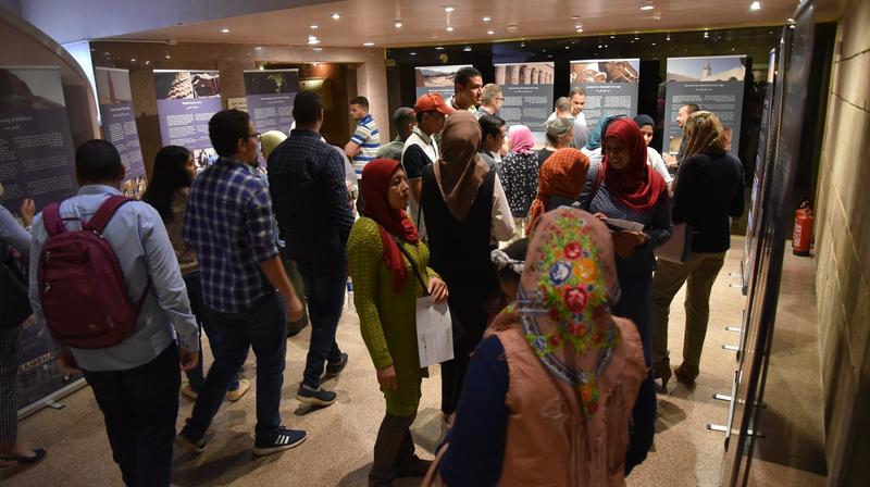
Visitors attending the opening of the exhibition, Nubian Museum, Aswan, Egypt, November 2018. Photographs: EAMENA.


